Care Team Request: Social Good Case Study
Care Team Request is an app case study project for a social good. The concept is a small community based app that allows anyone in need to make a request for health issues, mobility challenges such as moving locations, or other personal circumstances, to submit for help. Volunteers can review requests, find a match of an organization that is in need of a volunteer position or be a part of a small community group to help individual people in need who put in a request.
Role: Product Designer: Solo (End-To-End) Timeline: 8 Weeks
Tools: Figma, Adobe Illustrator
Problem
People often need short-term help with tasks like errands, moving, or health support, but submitting requests and coordinating volunteers is confusing. Volunteers may want to help but don’t always follow through because expectations are unclear, leaving needs unmet.
Goals
Care Team Request makes it simple for those who want to request or offer short-term help in their community. The app focuses on clarity and ease of use so requests are easy to submit and volunteers can quickly understand what’s needed. This encourages more people to give and receive help, ensuring support reaches those who need it.
Business Goals
Care Team Request aims to connect people who need help with willing volunteers, making short-term support simple and accessible. The app encourages community participation, builds trust, and strengthens local support networks.
Emergent Needs
People facing urgent situations often struggle to ask for help, or they may not even know of any communities that could help them. Volunteers don’t have an easy way to even find those opportunities. The existing tools are too complex, tedious or slow making it difficult for requesters to communicate their needs and receive support on time.
Safety Considerations
Since Care Team Request connects volunteers with people in need, safety and comfort are important concerns. Requesters may feel uneasy allowing strangers to help with personal tasks, and volunteers need to know what’s expected. To address this, the app focuses on clarity and control: requesters provide details about the task and can choose which volunteers to accept, while volunteers see clear instructions before committing. Optional volunteer verification and a community-focused approach help build trust, ensuring that both sides feel confident and safe using the app.
Design Process
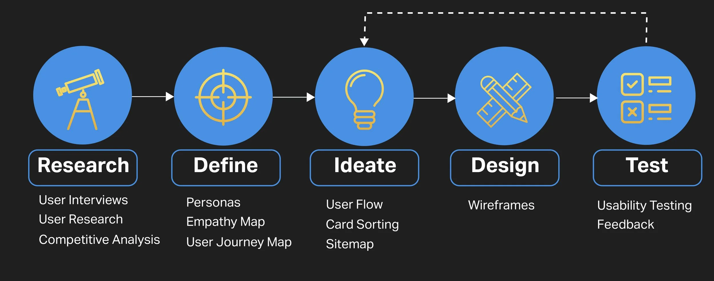

Qualitative Research
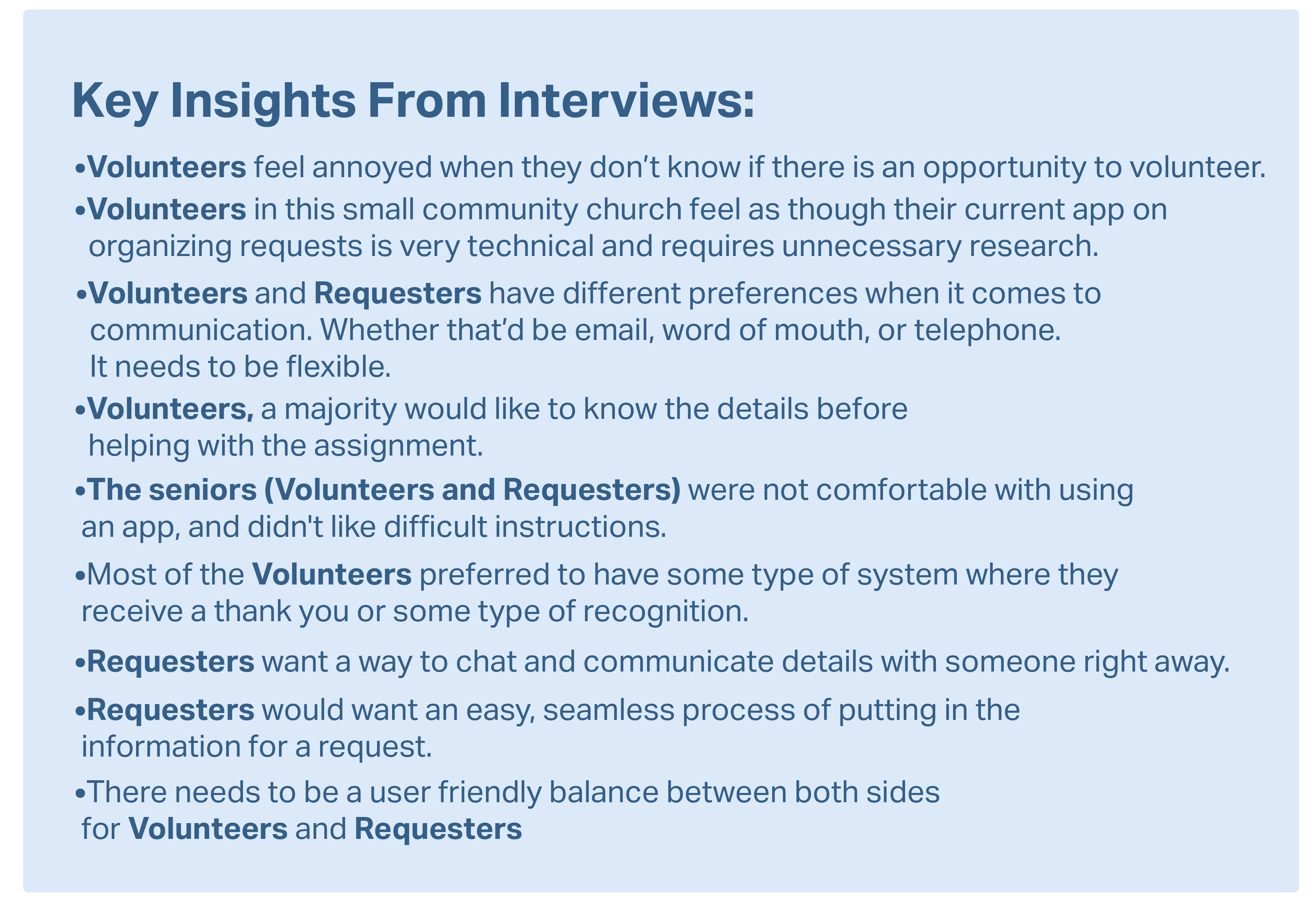
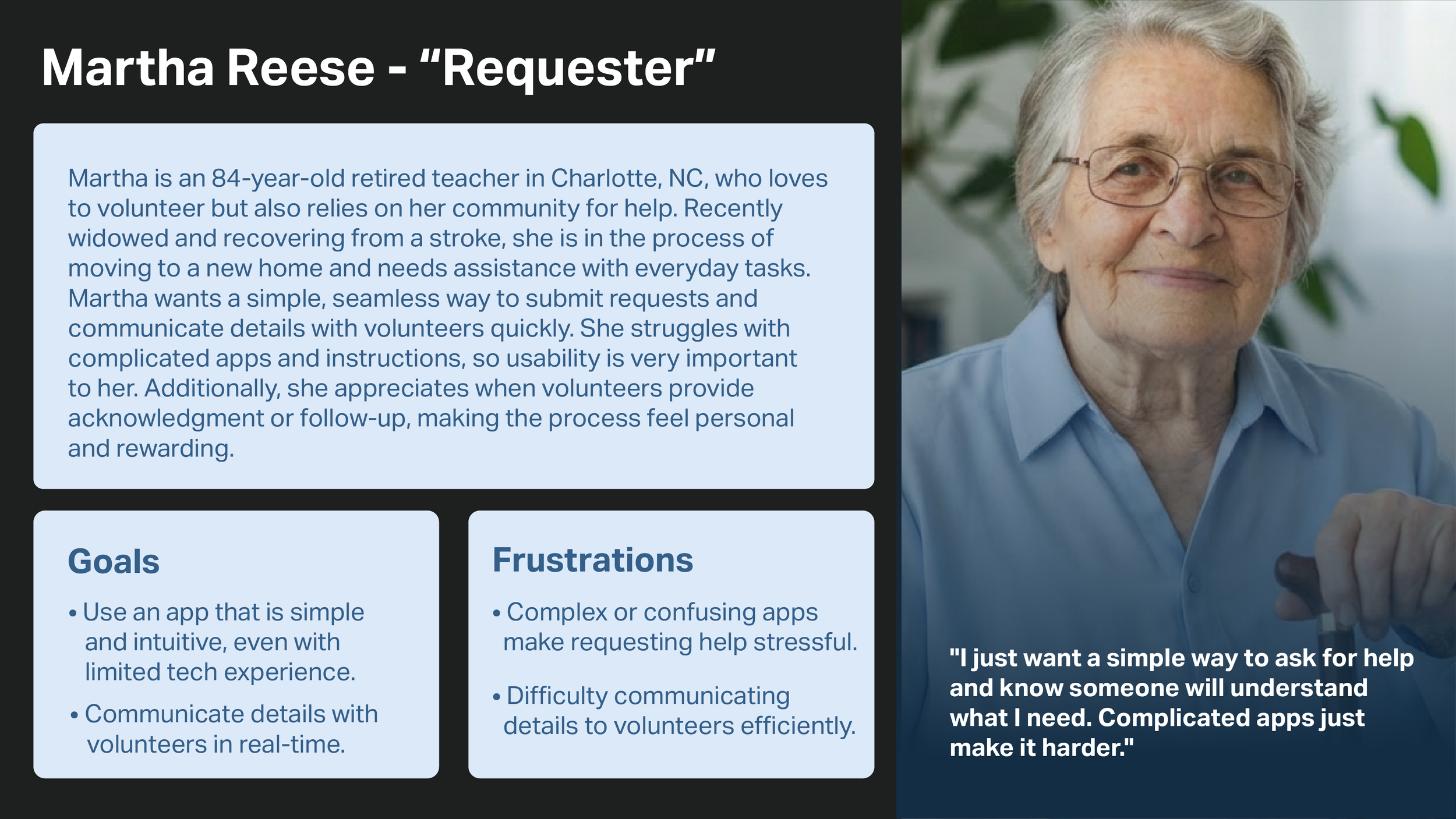
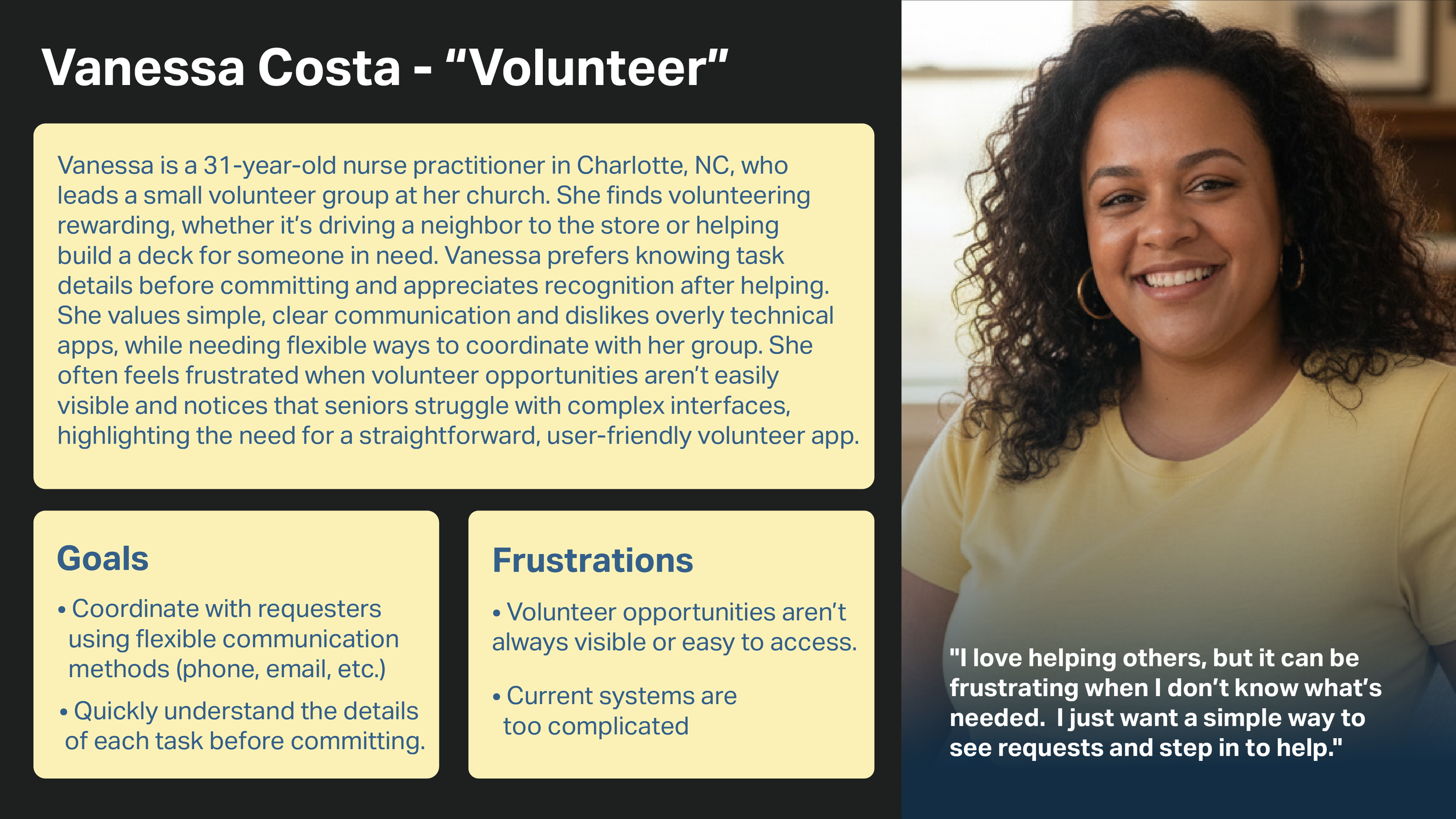
I interviewed 6 people: Splitting a mix of questions between 3 Volunteers and 3 Requesters. They were each from different age groups at the church that has a care team program of volunteers who answer requests from people who need services. Some of these requesters are seniors in need of a helping community and others are ones who need requests such as building a deck, or moving.
Volunteers: a person who freely offers to take part in a task. They are the ones who receive the requests and help others. A few volunteer oriented sample questions are below:
• Can you tell me about a time you volunteered? What did you enjoy most?
• What’s the most frustrating part of volunteering or finding opportunities?
• Do you currently use apps or online tools for volunteering? What do you like or dislike about them?
Requesters: a person who submits a request for help. A few requester oriented sample questions are below:
•What types of tasks or support do you find most difficult to manage on your own?
•Are there things that make it uncomfortable or difficult for you to ask for help?
•How comfortable are you using apps or websites to request help?
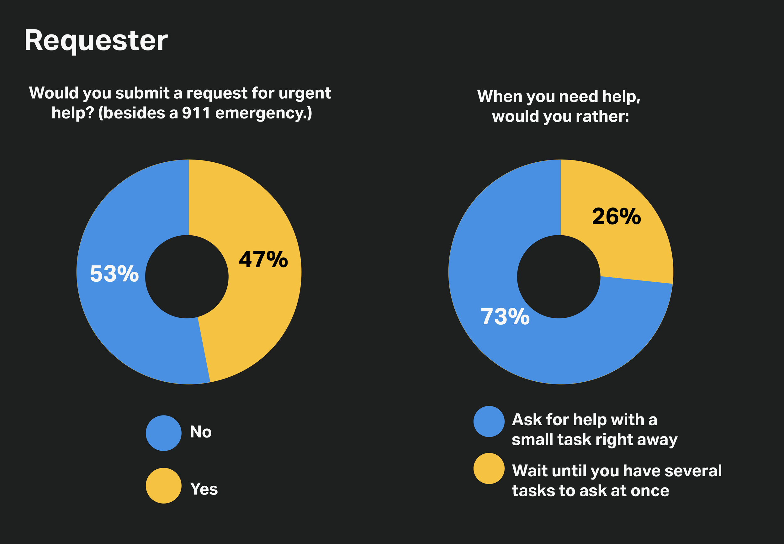
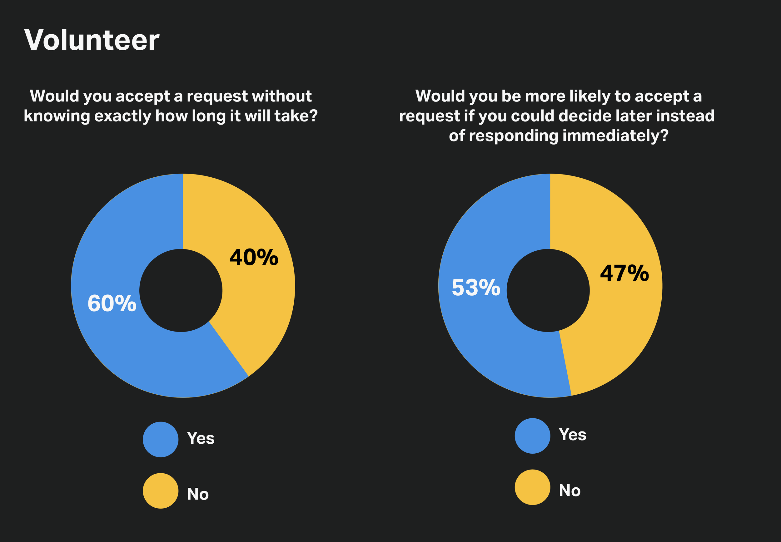
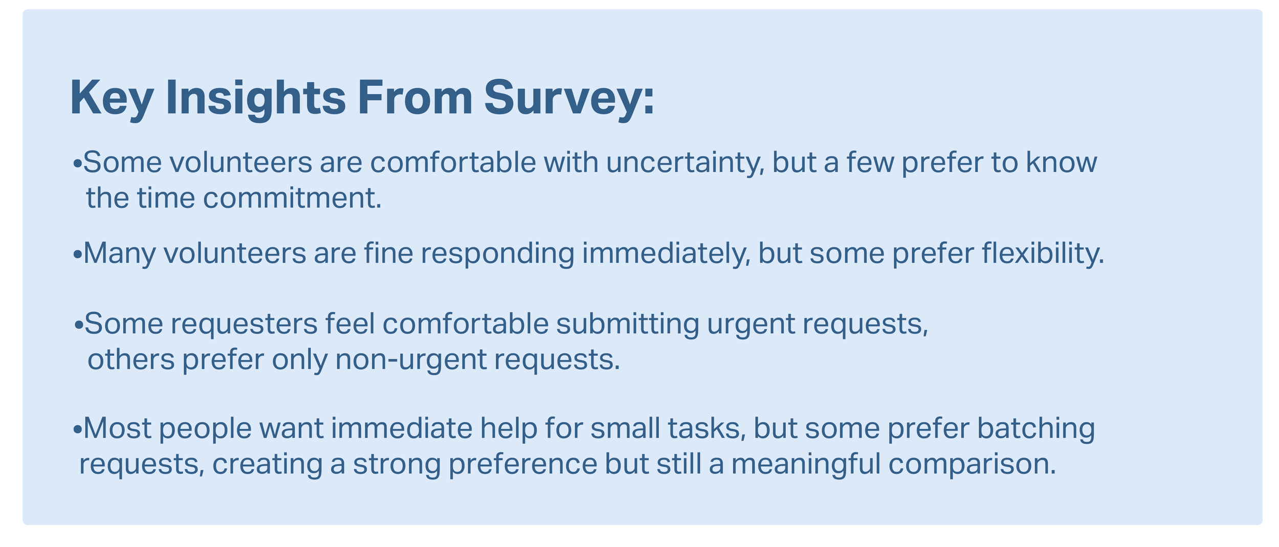
Quantitative Research
For quantitative research, I asked 15 people to do a survey and answer the 4 questions. 2 are Requester based questions and 2 are Volunteer based questions.
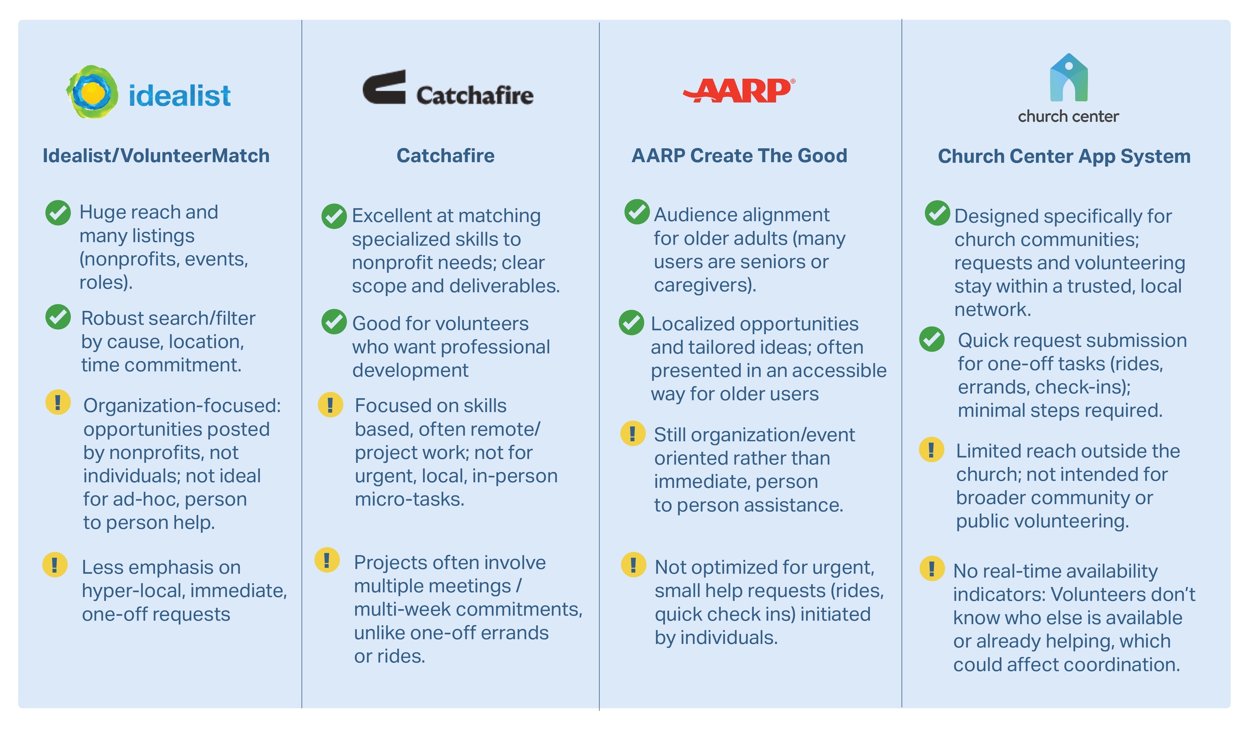
Competitive Analysis
To better understand the space, I looked at a few apps and organizations that already coordinate volunteers and community help.

Personas & Empathy Maps
After gathering the information from the interviews and the survey, I created two personas, one representing a requester and another as a volunteer..The personas gave me a deeper understanding as an average of the user’s goals and frustrations.
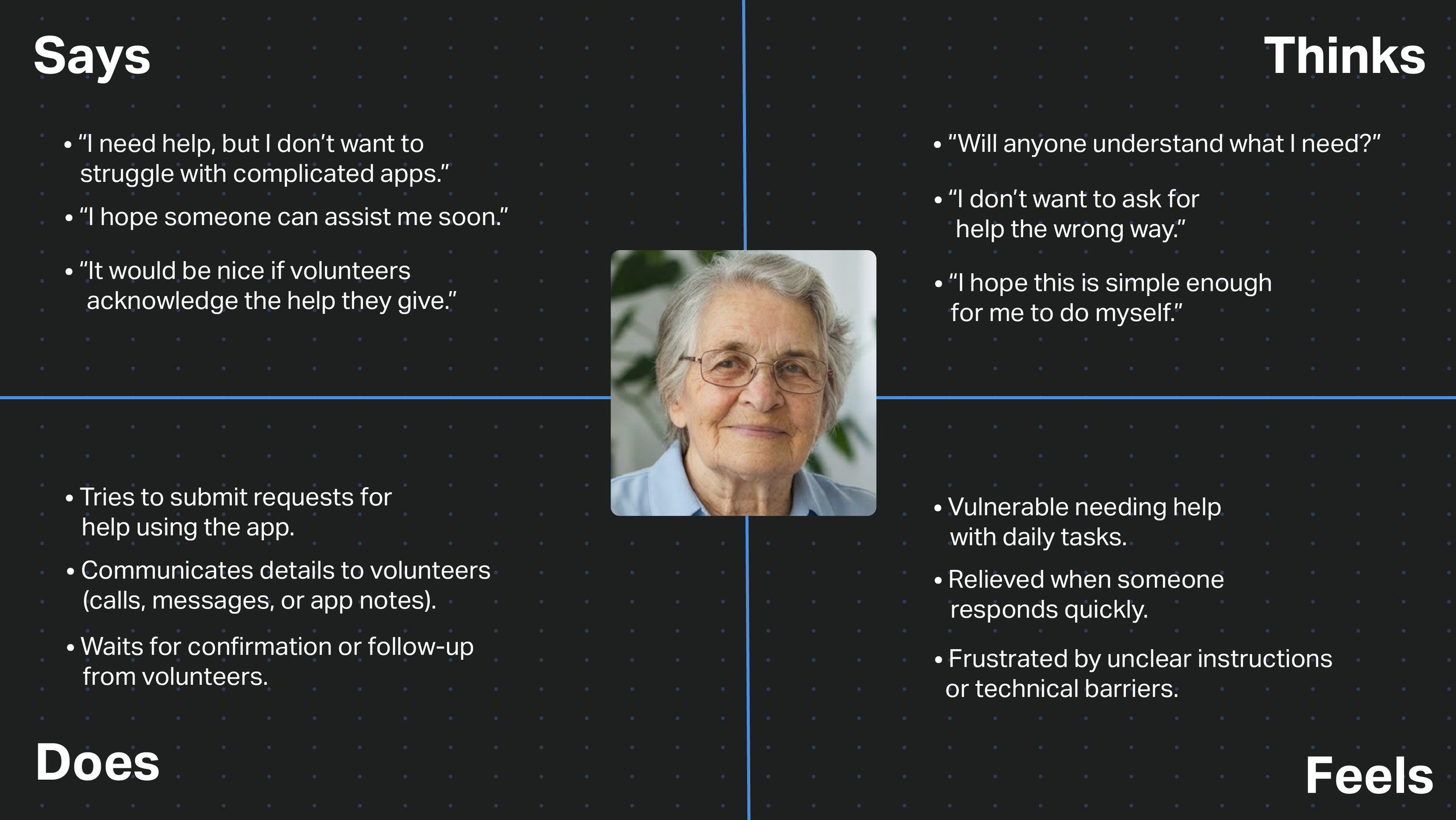
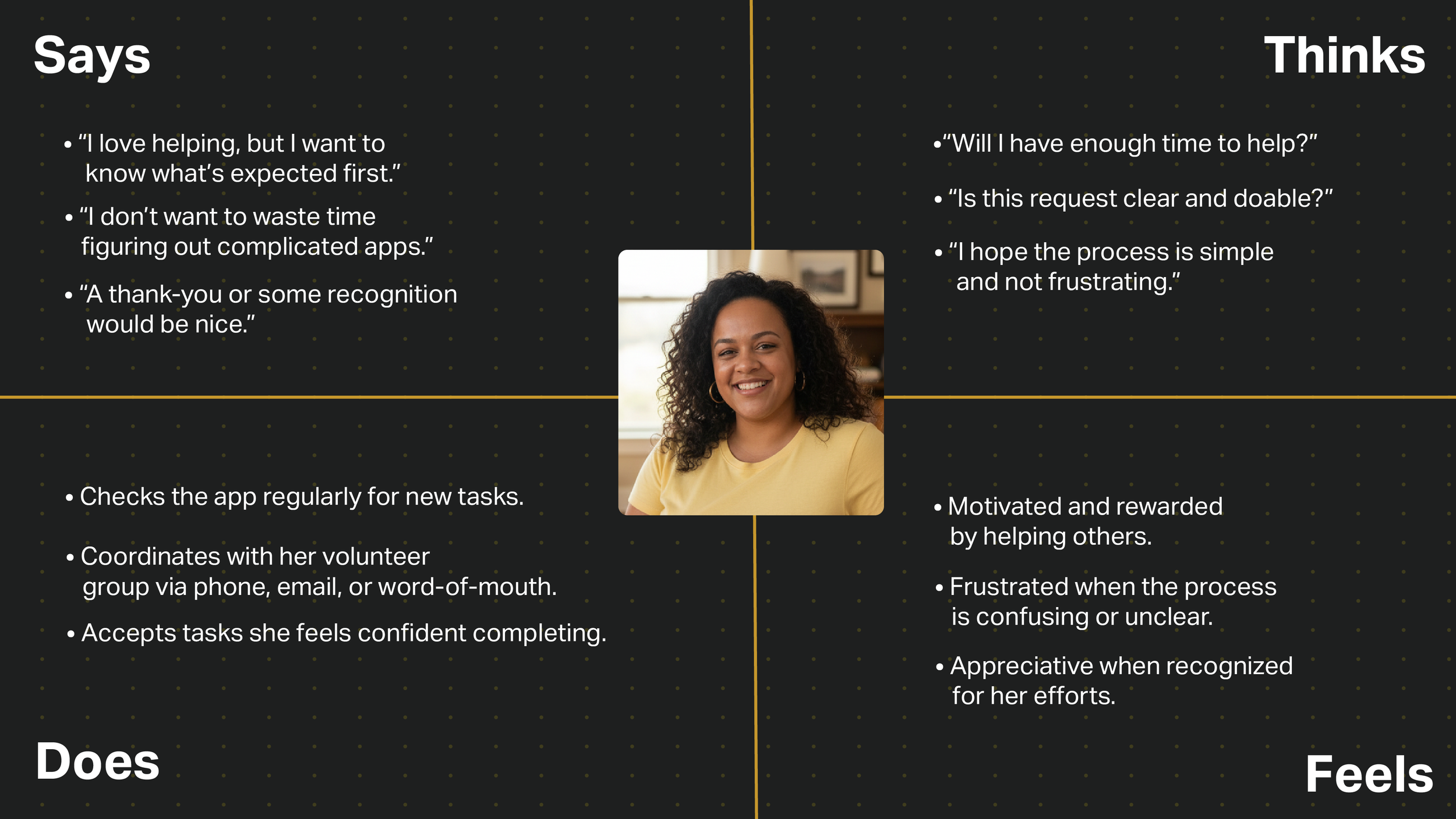
Then I created empathy maps to follow up and define the app’s target audience. This helped me get a better view on their needs, actions, thoughts and feelings. The data is derived from the user interviews key insights.
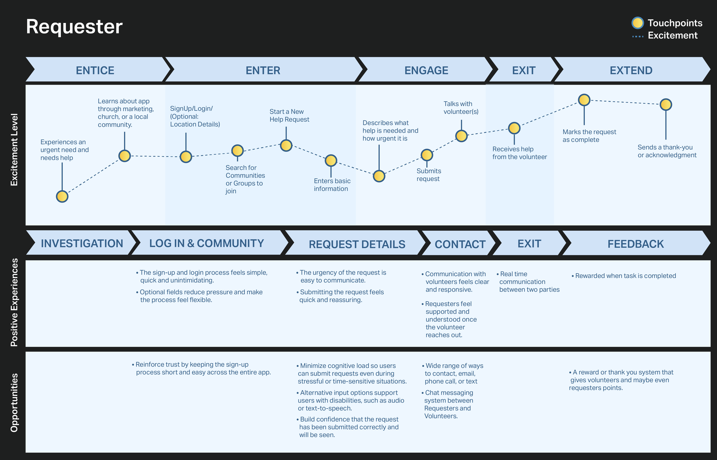
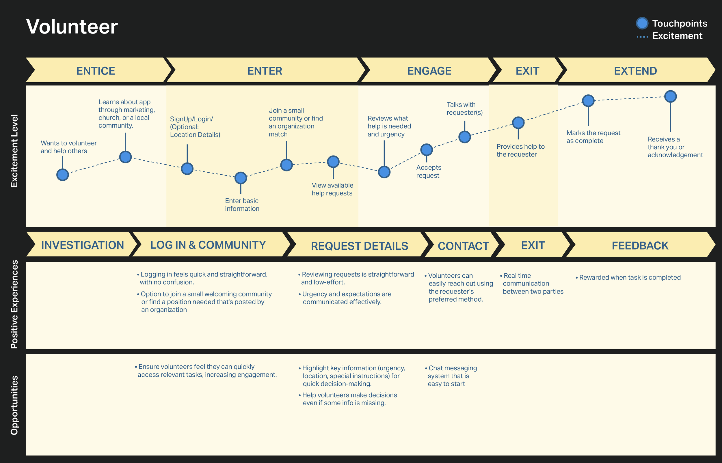
User Journey Maps
A visual infographic was made of the user’s journey across different touchpoints for every step they take to see where the user experience could be improved. Requesters and Volunteers use the same app, but they have different paths they take through their journey. A journey map for each one was created in the same format.

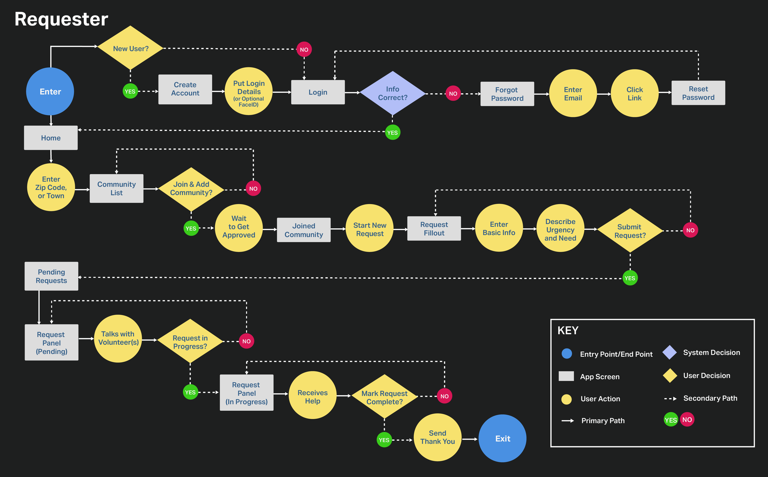
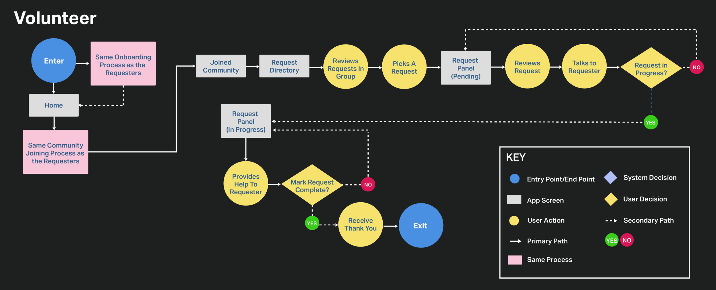
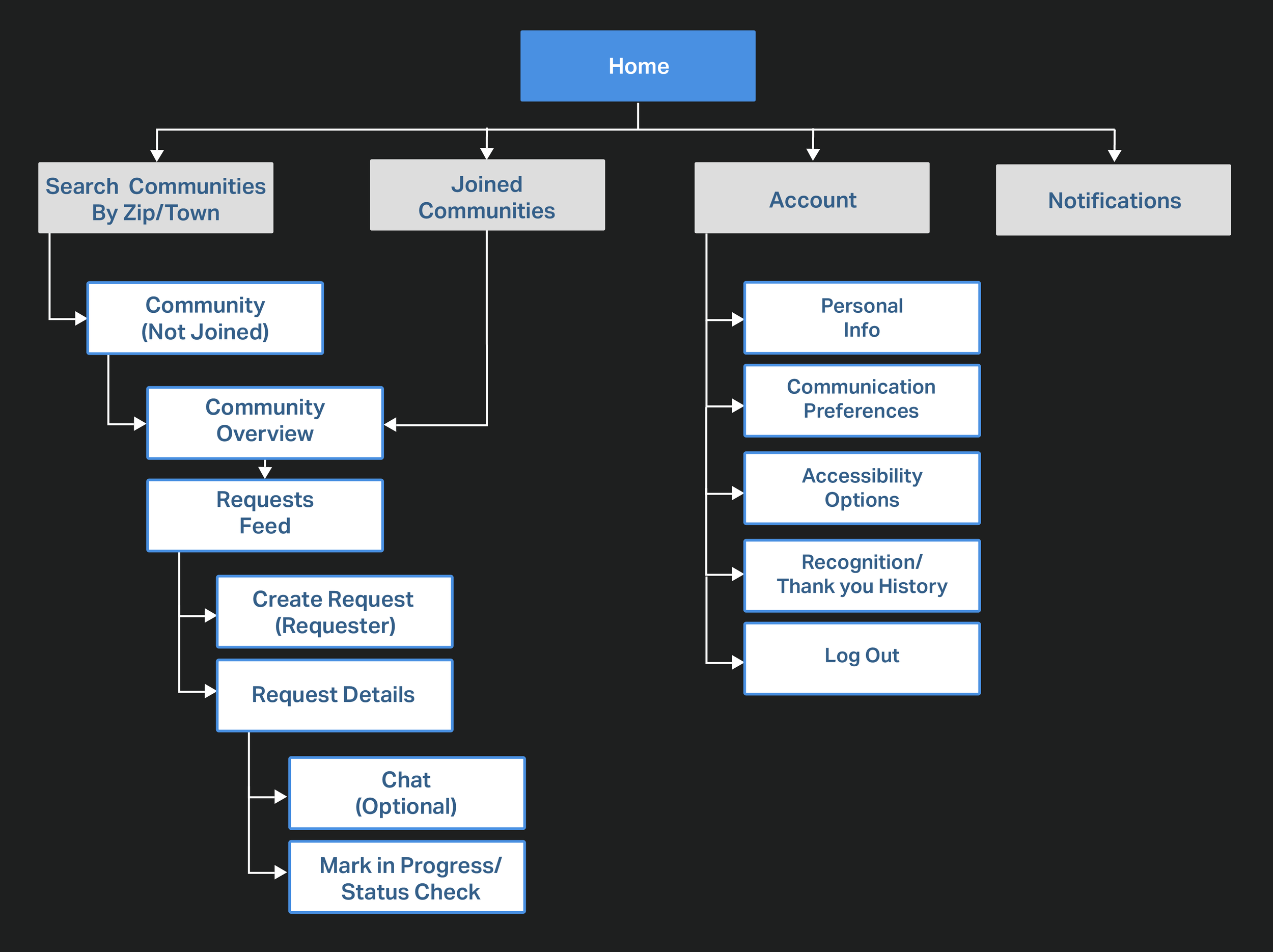
User Flow
To follow up, two user flows were created to match up with the Requester and Volunteer journey maps. These were created using Adobe Illustrator and they show how the users navigate through the app.
Card Sorting
Card sorting helped put all the features in different categories to help lay out the sitemap.
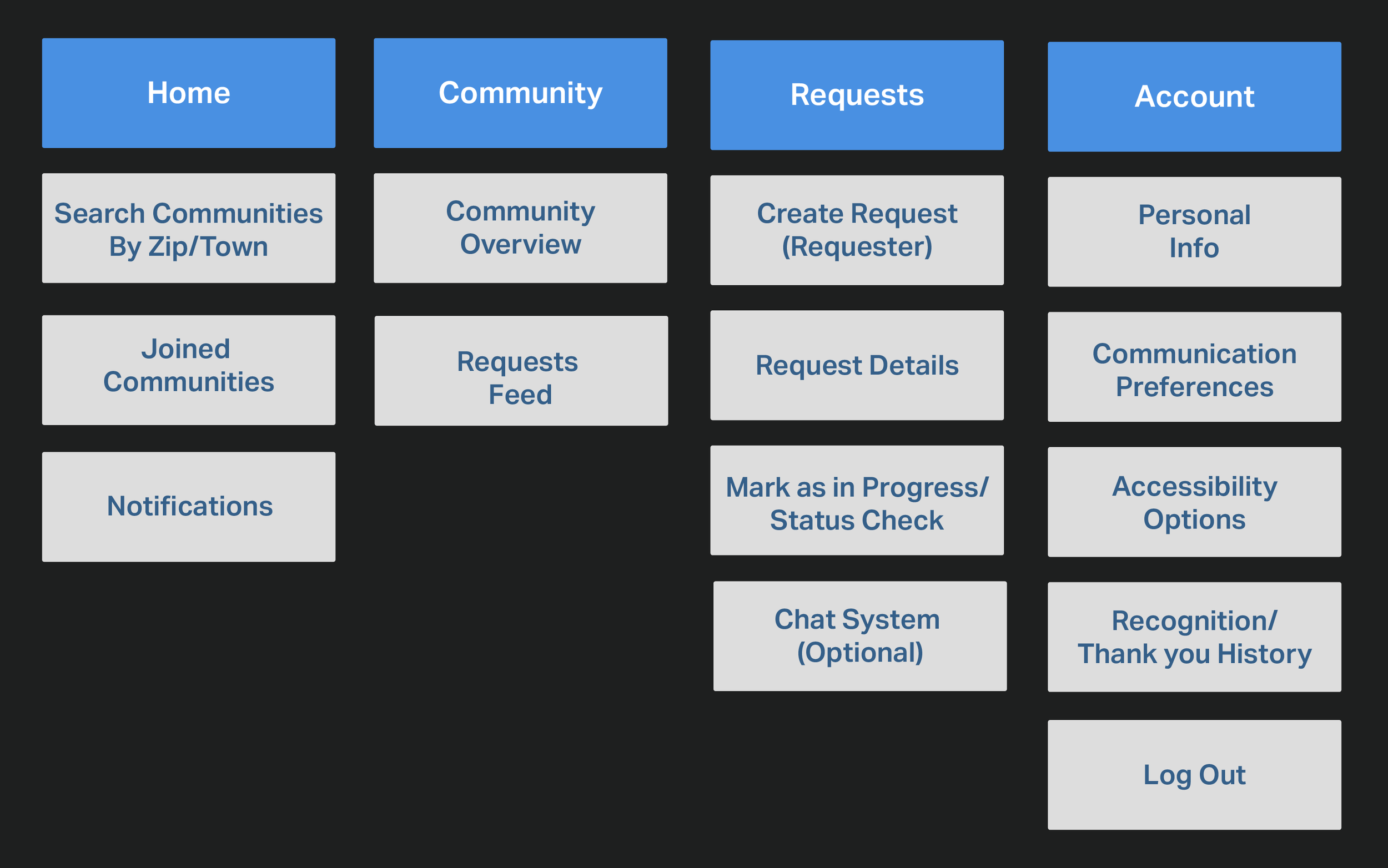
Sitemap
The card sorting was then used to create this sitemap. This helped map out what to organize on the screens while aligning with the app’s goals. Some parts were re-organized and its kept with only a few sections so that the process is linear.

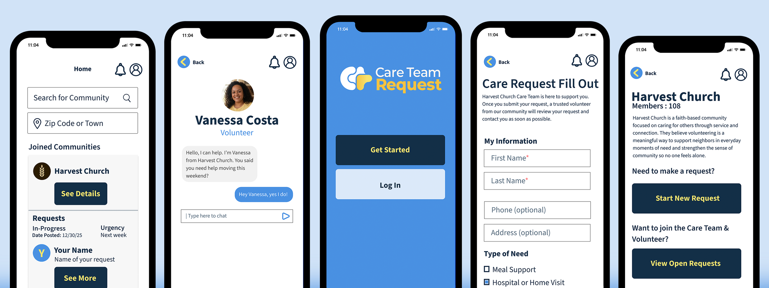
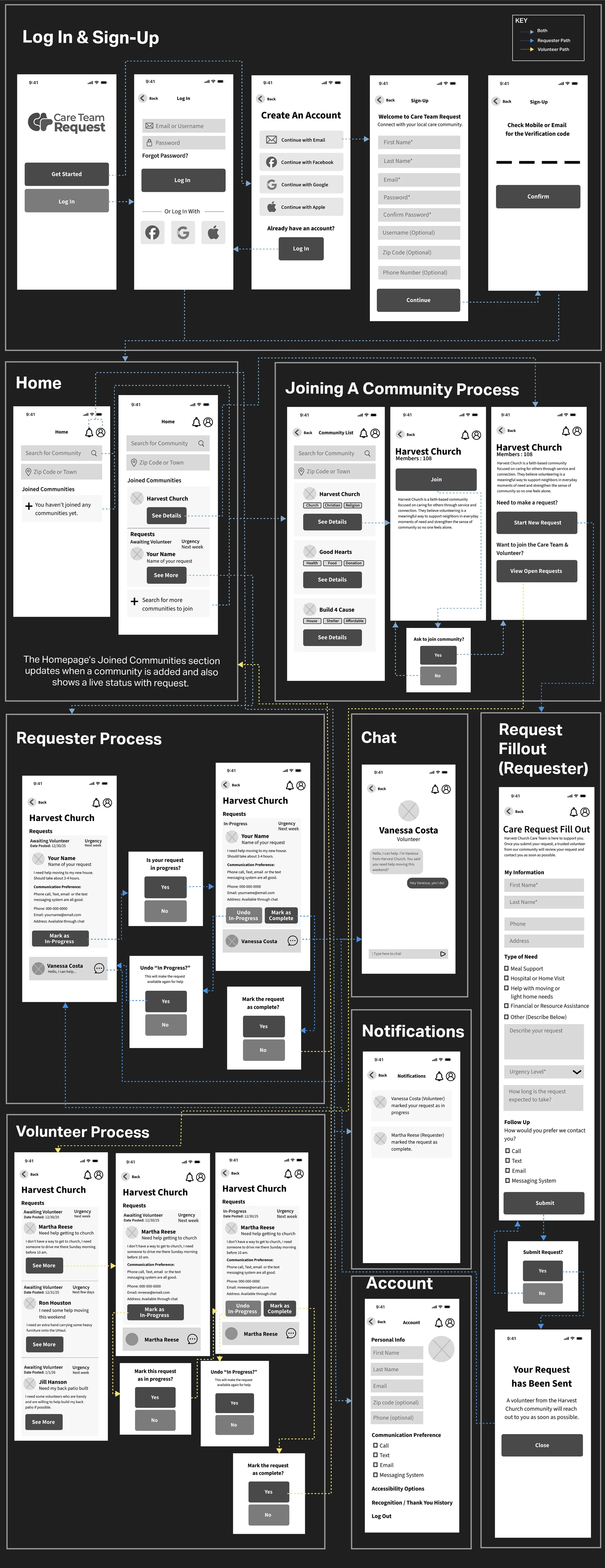
High Fidelity Wireframes
I took the information from the user flow and the sitemap to start sketching out some wireframes on paper. The app needed a simple system for our target audience to use, a design with not many options, and a step by step linear process since some of the target audience using this app are seniors. I adhered to iOS Guidelines and then finally built them into High Fidelity Wireframes using Figma.

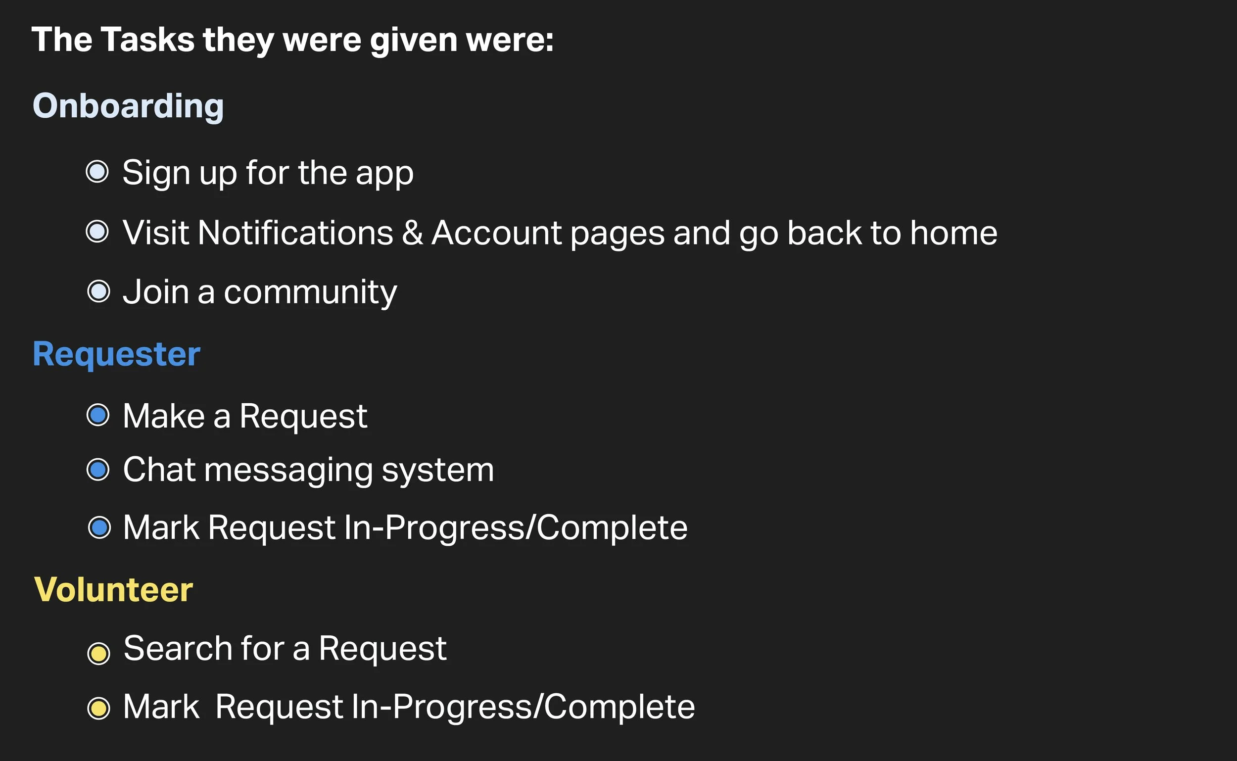
Usability Testing
Now that the visual design and HI-Fi Wireframes were finished, I tested the prototype with the Figma app with five users to test out how easy Care Team Request is to use. The tests were conducted in person where they were given tasks of both a requester and volunteer. I observed closely how they navigated through the app.
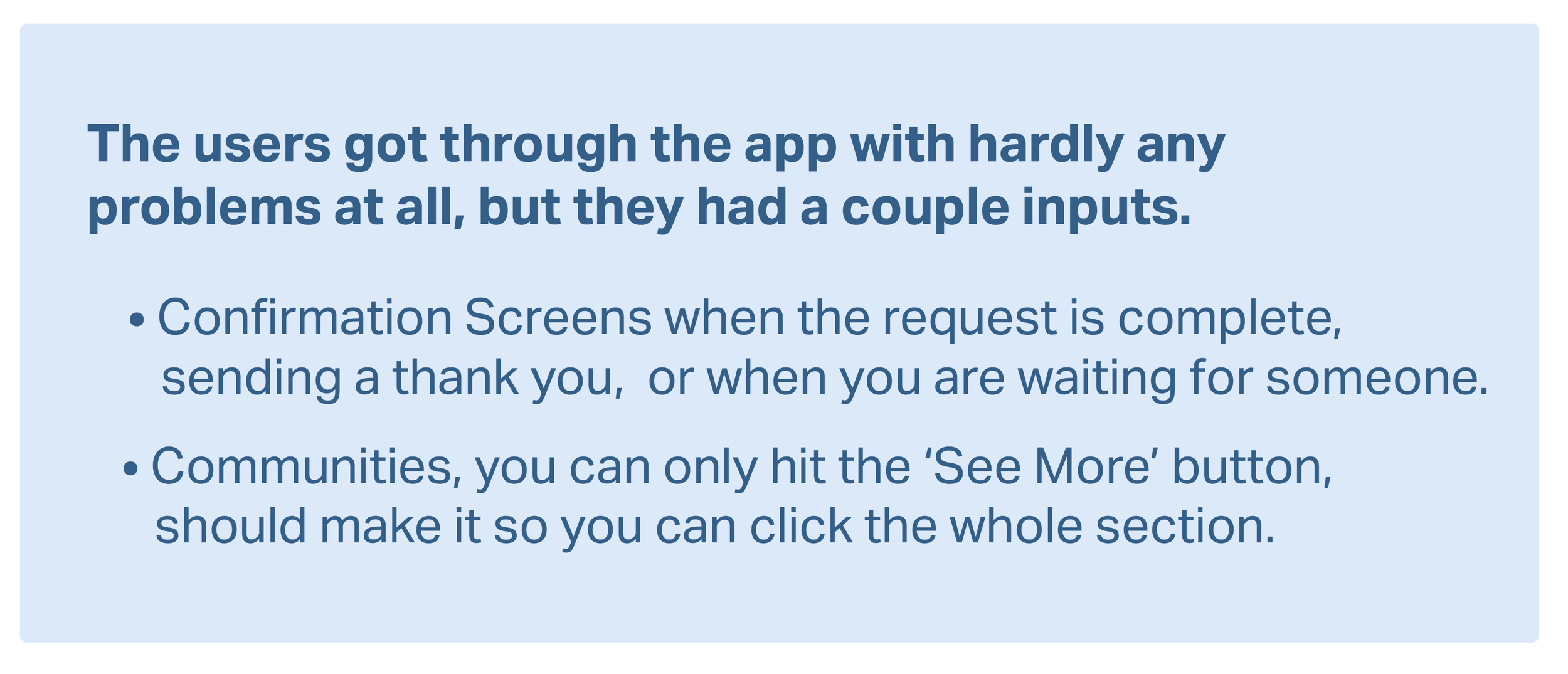
Feedback
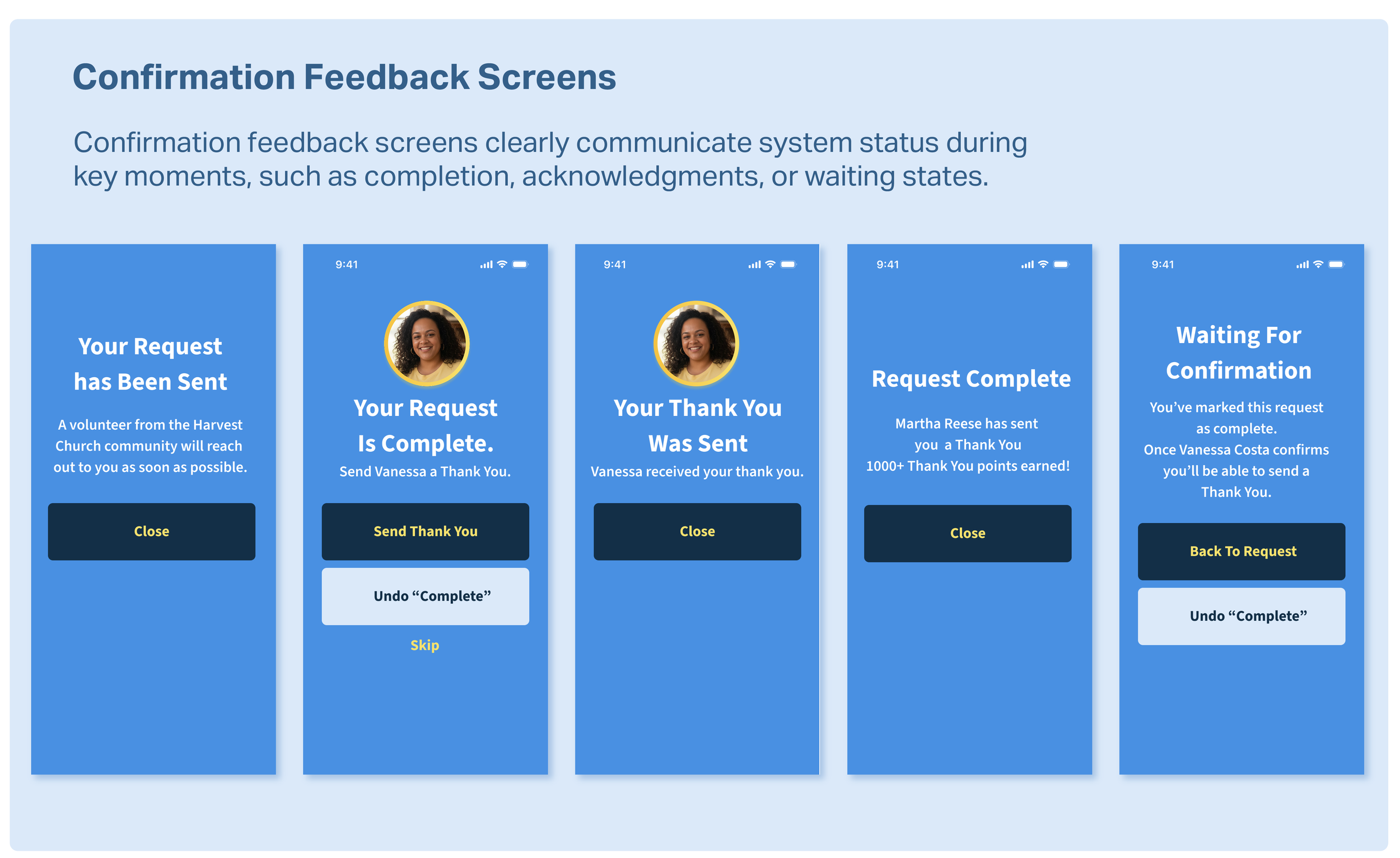
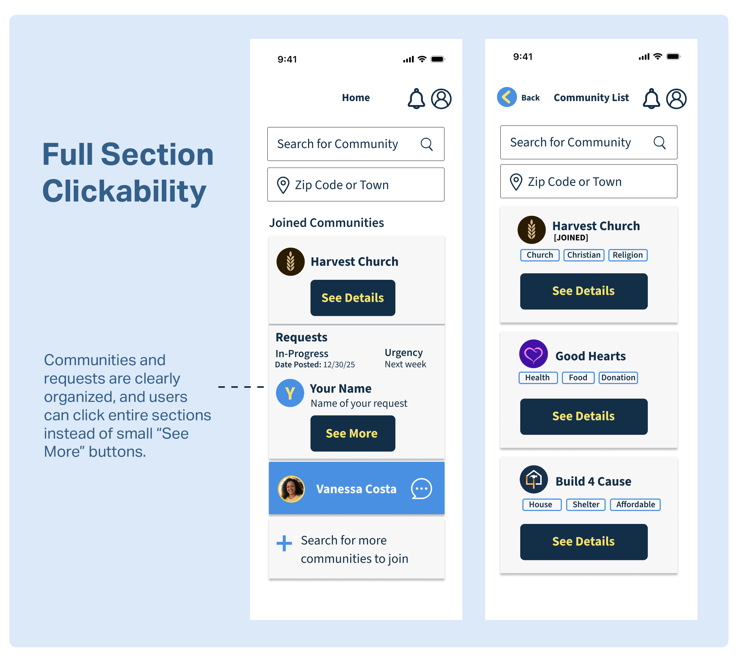
Finally I incorporated the feedback from the usability study and made some changes to the appropriate screens.
User Interface Design
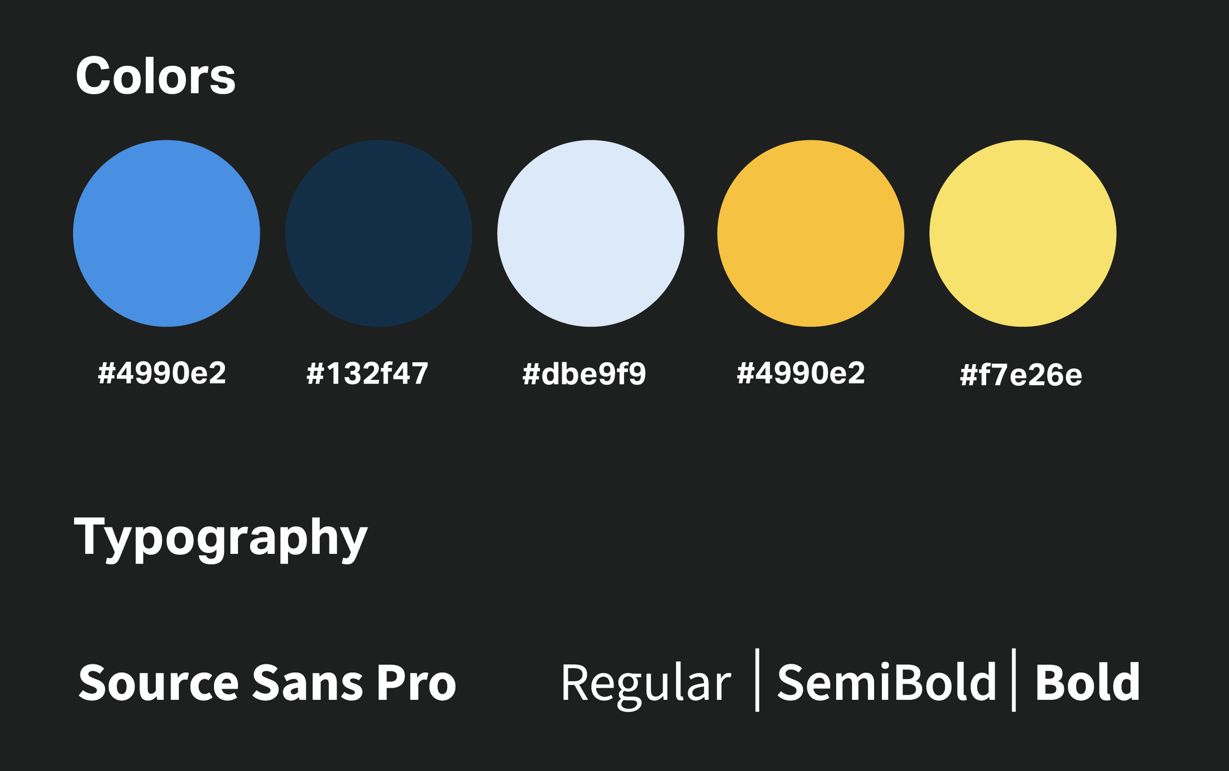
The UI uses a soft blue and yellow color palette to create a welcoming, trustworthy, and community-focused experience for adults of different age groups, including seniors. Blue reinforces reliability, while yellow adds warmth and friendliness. A darker blue is used for primary buttons to create clear contrast and guide users toward key actions.
Source Sans 3 was chosen for its high readability and approachable tone, giving the app a familiar, neighborhood-friendly feel while remaining clean and easy to navigate.